LMC Rebrand
Rebranding an entire government department.
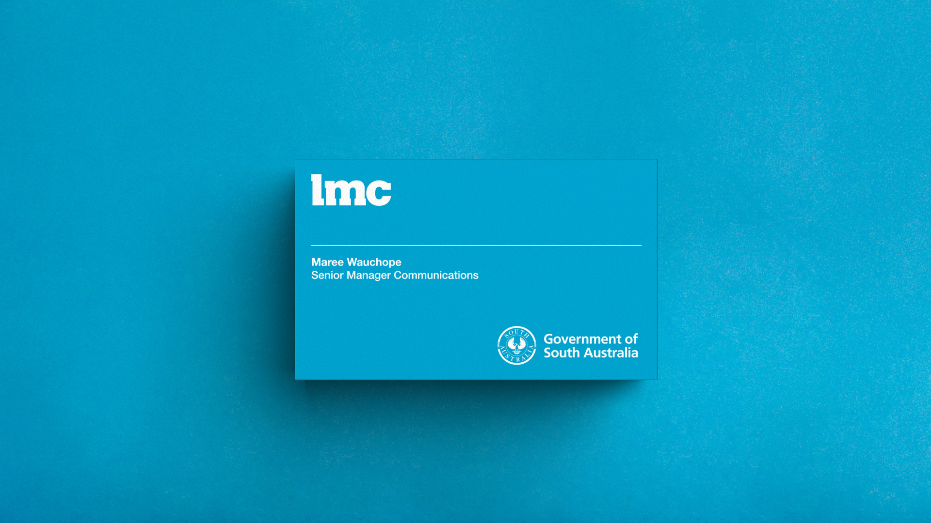
The South Australian Government’s Land Management Corporation (LMC*) develops and manages state-owned land assets. LMC wanted a fresh and contemporary identity, with ease of reproduction and legibility. Nicknack developed an identity that could be used on a range of corporate materials including brand launch, stationery, internal forms, Annual Report and website.
The bold and straightforward approach also worked well with the necessary co-branding requirements for the Government of South Australia logo.
Custom typeface for a unique look.
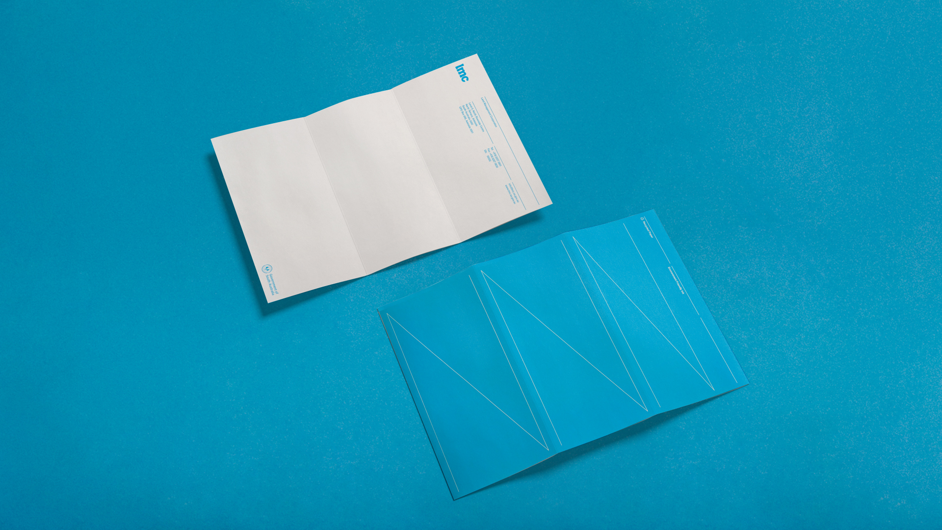
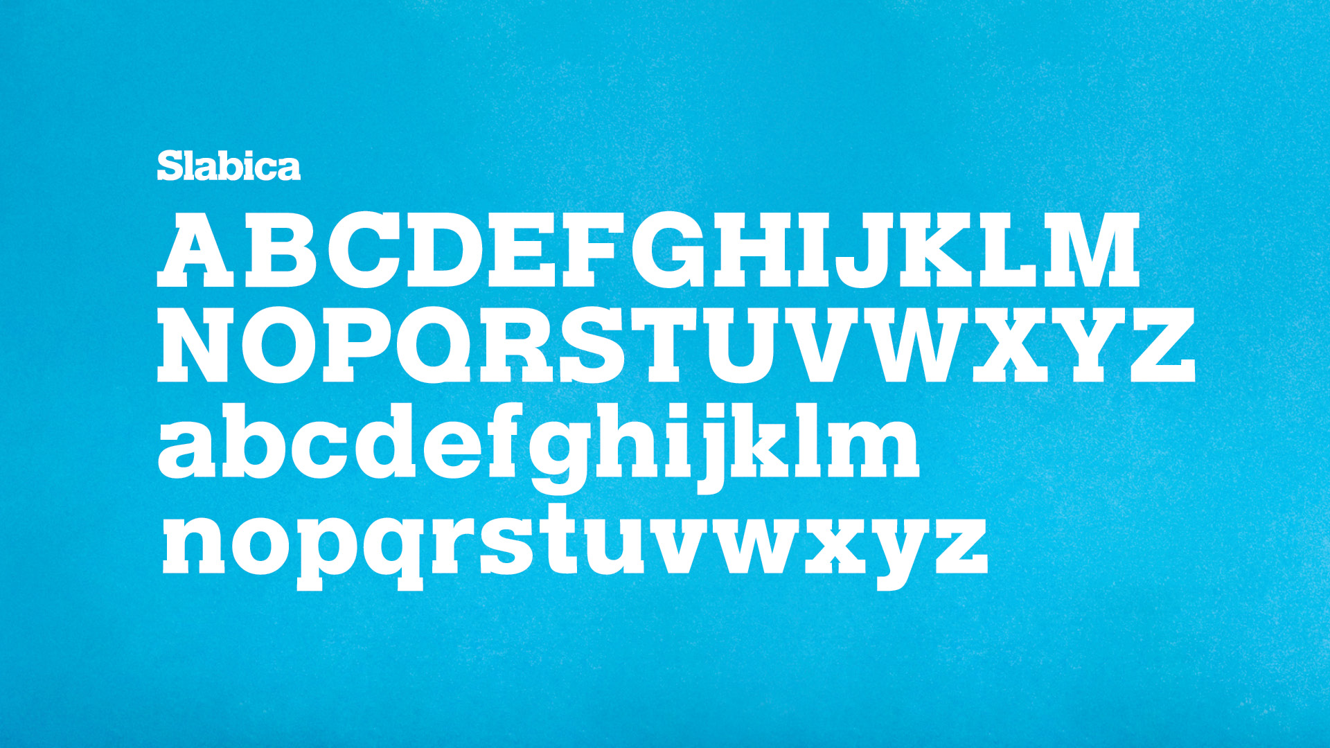
The first step towards a fresh and contemporary identity was taken with the creation of a new typeface, Slabica. A Helvetica hybrid with modified slab serifs, it coexisted harmoniously with LMC’s corporate typeface, Helvetica. Next came a re-evaluation of brand colours, then integration of the new design elements across a range of corporate material including brand launch, stationery, internal forms, annual report and the website.
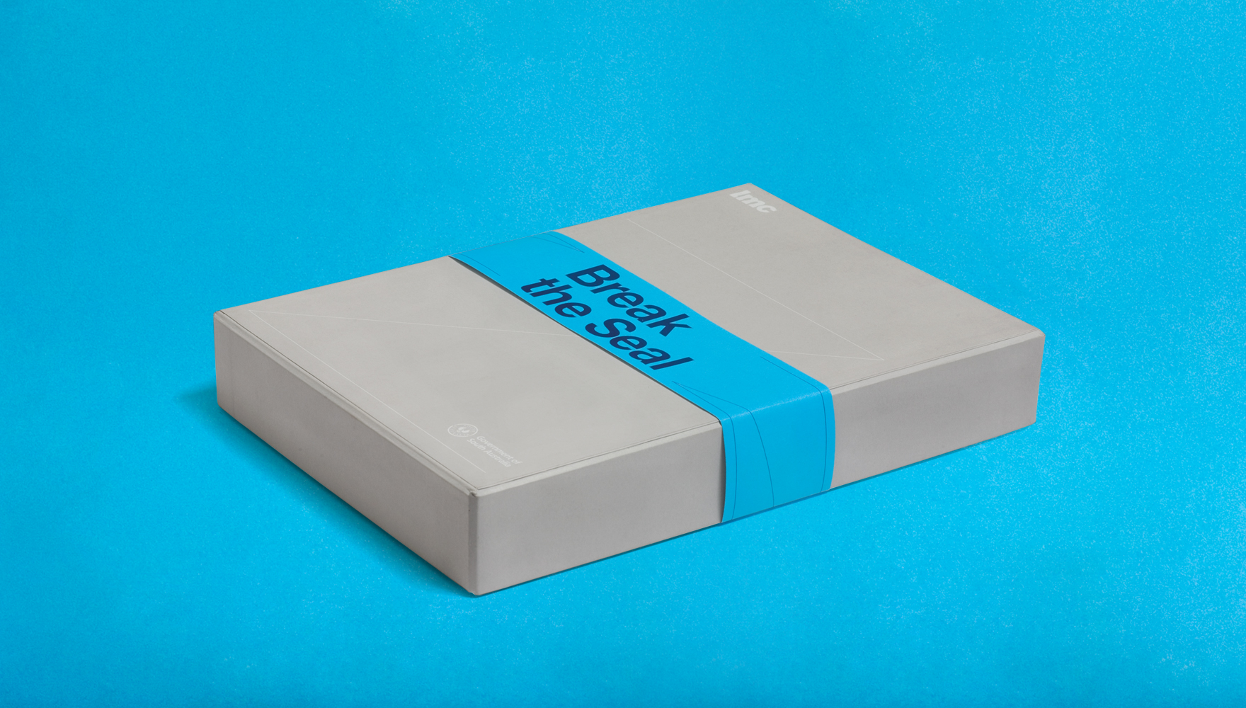
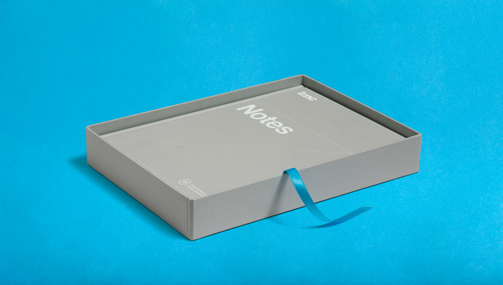
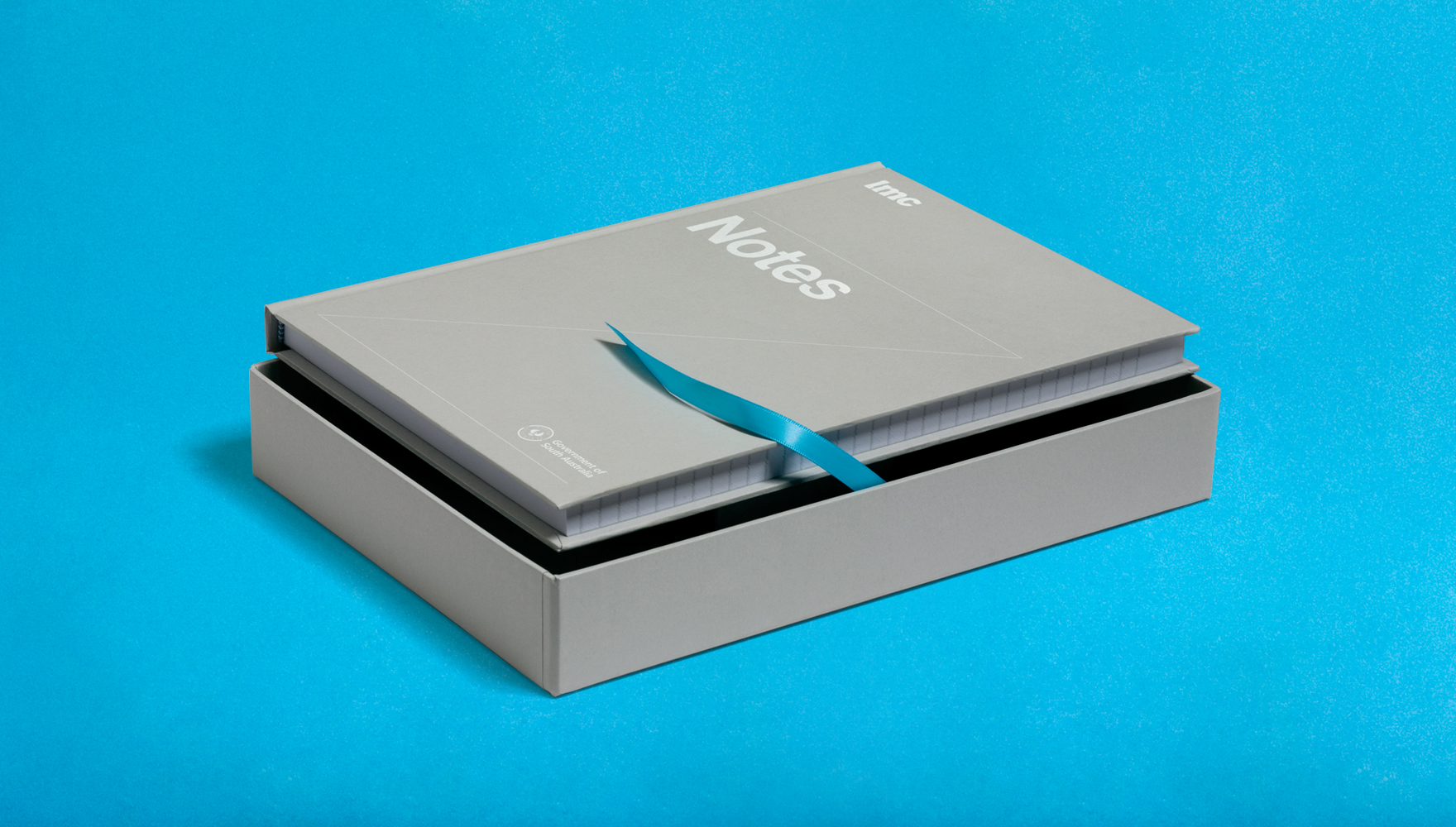
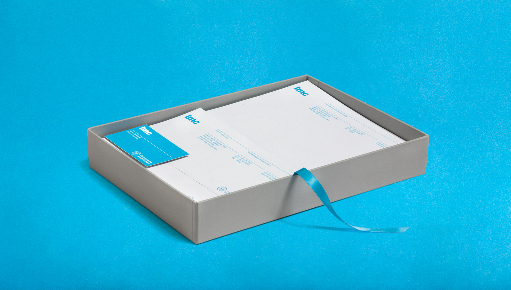
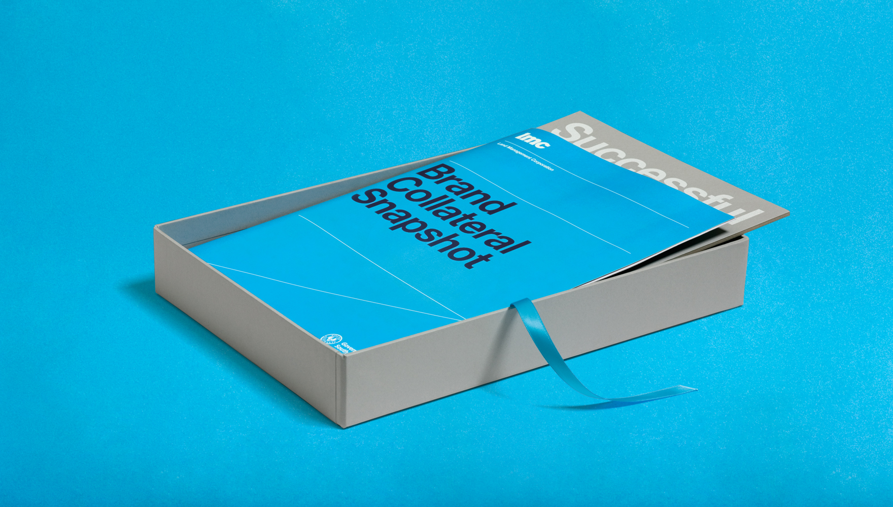
A launch pack was also created with the specific intent of revealing the new identity to board members and gaining their approval.
A launch pack was also created with the specific intent of revealing the new identity to board members and gaining their approval.
Imagery that really sets the brand apart through custom photography.
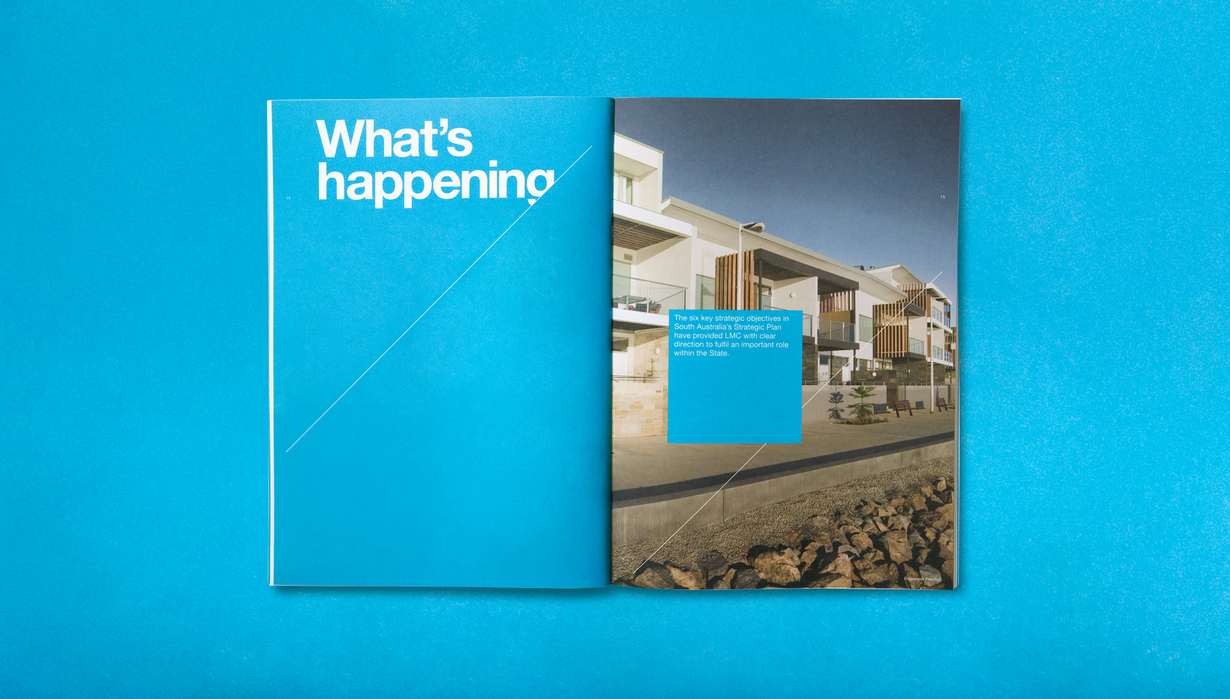
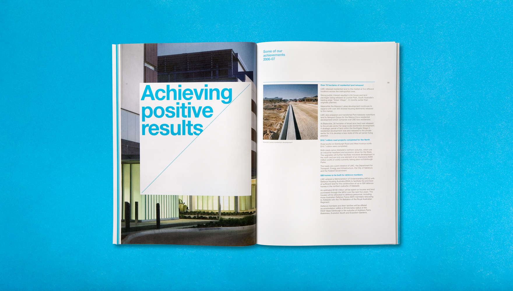
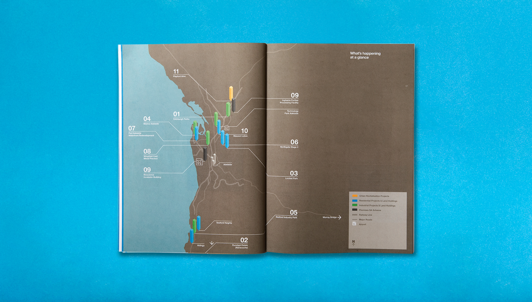
Photography was also commissioned for the annual report and website to create the sophisticated and professional image the client desired. Maps were also redrawn to aid comprehension while environment-friendly paper stock and inks were sourced in keeping with the client’s sustainability policy.
Complete communications package for brand launch.
The rebranding strategy also made necessary provisions for communication with different audiences: corporate and government, community, environment, and development groups. It also works well with the necessary co-branding requirements for the Government of South Australia logo. To sum up, the exercise has been a huge success with LMC successfully repositioning itself.
This page shows various creative elements developed for the brand, including website design, launch direct mail, corporate stationery, custom typography and annual report.
*LMC has since changed their name to Renewal SA.
This page shows various creative elements developed for the brand, including website design, launch direct mail, corporate stationery, custom typography and annual report.
*LMC has since changed their name to Renewal SA.