Adelaide Airport Rebrand
Building an identity from a corporate vision.
Adelaide Airport is widely recognised as the gateway to South Australia, catering for close to 8 million domestic and international passengers each year. The airport is also a major business hub for the State, and is SA’s largest single site employment precinct.
In 2013, Adelaide Airport Ltd (AAL) implemented a parallel but separate marketing communications process to rebrand the company and create a Vision that would take it forward for the next 30 years. Both needed to appeal to consumers who fly in and out on an occasional or regular basis, and at the same time to companies either already based at the airport or looking to create a presence there.
Equipping a corporate vision to take to the skies.
With strategic objectives that extended beyond the traditional business model of an airport, Adelaide Airport was looking to expand the scope of its operations and reposition itself as a self-contained business destination. After all, the Airport had grown to become South Australia’s largest single-site employer, adding nearly $2 billion annually to the state’s economy (2.1% of Gross State Product). Plus, with 100 hectares of prime real estate and facilitated investment forecast to touch $1 billion within the next few years, Adelaide Airport was looking to position itself as a next generation hub for business rather than being a mere stepping stone for travel.
Not only was this aligned to the Airport’s vision of becoming a top-tier business centre in the Asia Pacific region, it was also in keeping with the global trend of the aerotropolis i.e. a city developed around an airport. Given such a future direction, a new brand identity was required that would launch the company into its next phase of growth and development.
Not only was this aligned to the Airport’s vision of becoming a top-tier business centre in the Asia Pacific region, it was also in keeping with the global trend of the aerotropolis i.e. a city developed around an airport. Given such a future direction, a new brand identity was required that would launch the company into its next phase of growth and development.

Multiple challenges implies the need for a sophisticated branding solution.
Nicknack was engaged as a strategic brand and marketing agency to address the marketing challenge for the rebrand i.e. to engineer a shift in the way Adelaide Airport was perceived by customers, travellers and the community at large. The Airport brand needed to make a conscious move towards being seen as “more than just a terminal for arrivals and departures”.
Another challenge was to create a brand that would appeal to two highly distinct audience groups — travellers and corporate (consisting of business development, property, trade, government and industry bodies, shareholders etc). Both groups had completely different expectations from Adelaide Airport, which meant that the brand identity needed to be flexible enough to support two completely different attributes and personalities.
Another challenge was to create a brand that would appeal to two highly distinct audience groups — travellers and corporate (consisting of business development, property, trade, government and industry bodies, shareholders etc). Both groups had completely different expectations from Adelaide Airport, which meant that the brand identity needed to be flexible enough to support two completely different attributes and personalities.


Identity based on market research and benchmarked against industry best practice.
A combination of research methodologies were implemented to arrive at the strategic considerations which informed the creation of the new brand identity for Adelaide Airport. The agency reviewed existing customer research available with the client to understand perceptions held by customers and key stakeholders, which helped bring clarity to the positioning platform and brand attributes for the organisation.
In-depth desktop research was conducted to get an understanding of branding best practice within the global airport landscape. 75 of the top 100 airports as per the Skytrax World Airport Awards 2013 were examined, which provided a list of the world’s top industry performers against which Adelaide Airport could benchmark itself. This global perspective helped to inform how Adelaide Airport’s corporate identity should evolve in terms of where the company should seek to align to the industry and where it should seek to create uniqueness.
In-depth desktop research was conducted to get an understanding of branding best practice within the global airport landscape. 75 of the top 100 airports as per the Skytrax World Airport Awards 2013 were examined, which provided a list of the world’s top industry performers against which Adelaide Airport could benchmark itself. This global perspective helped to inform how Adelaide Airport’s corporate identity should evolve in terms of where the company should seek to align to the industry and where it should seek to create uniqueness.
Brand Pillars as a strategic branding tool to inform identity design.
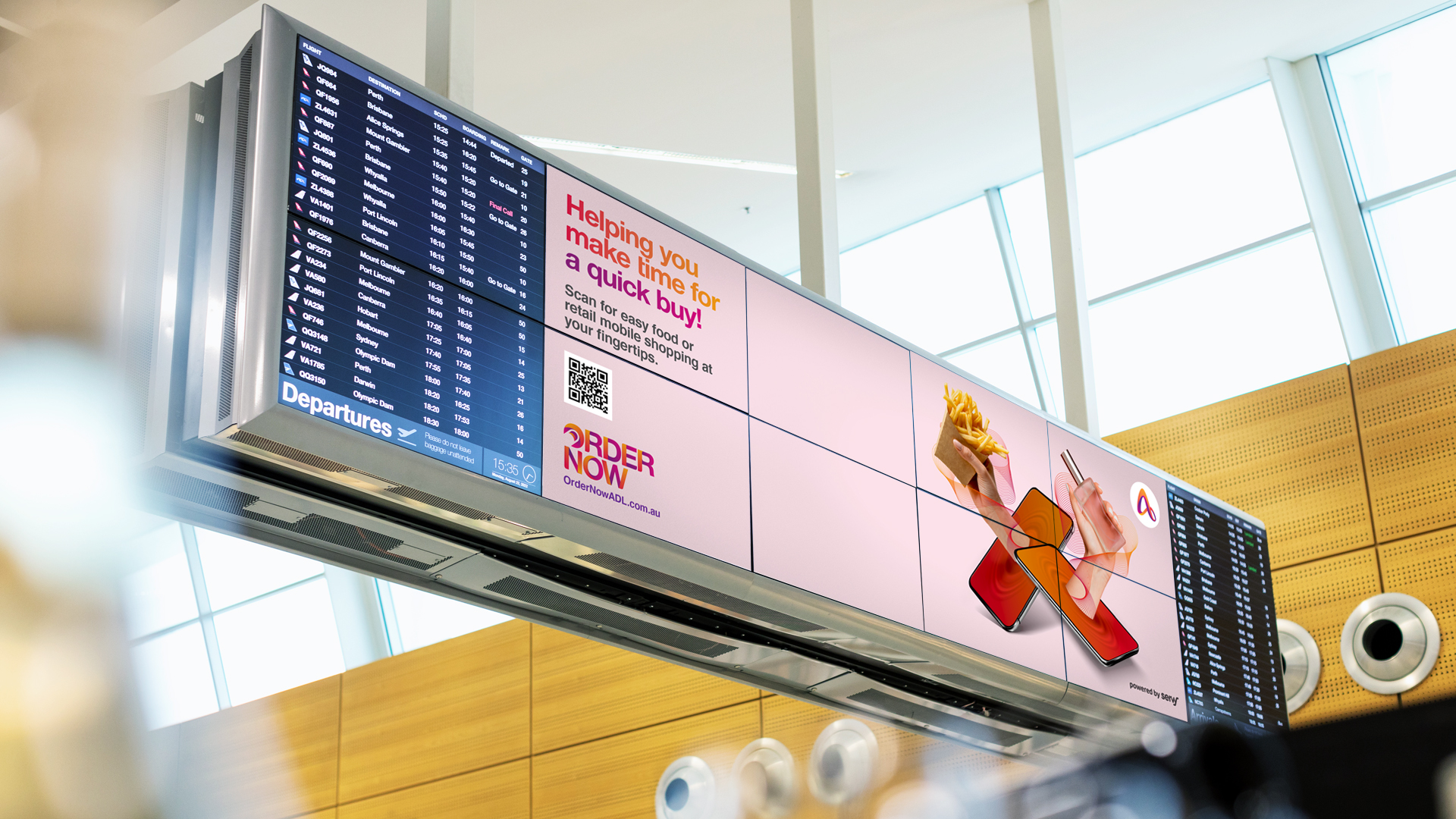
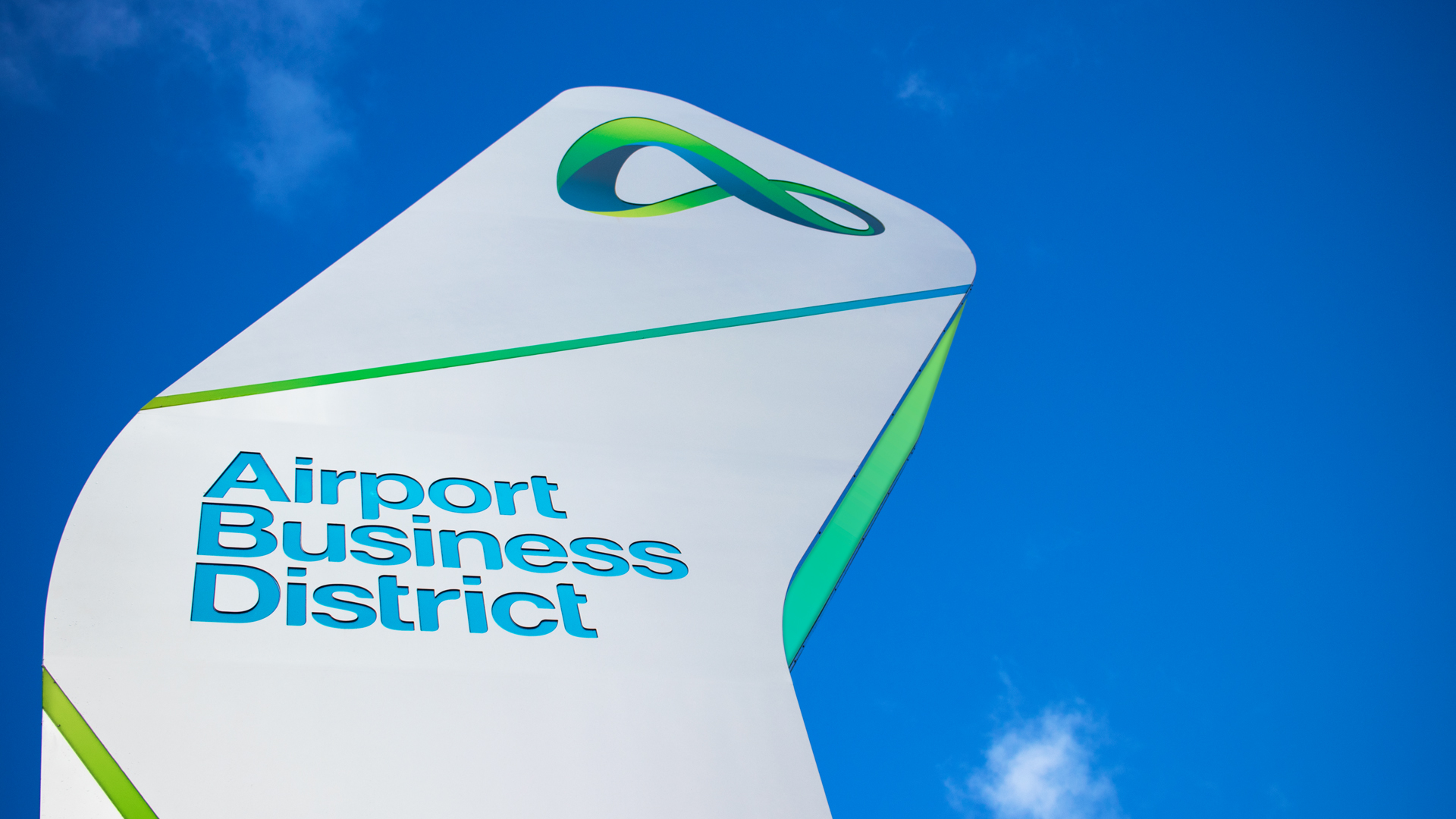
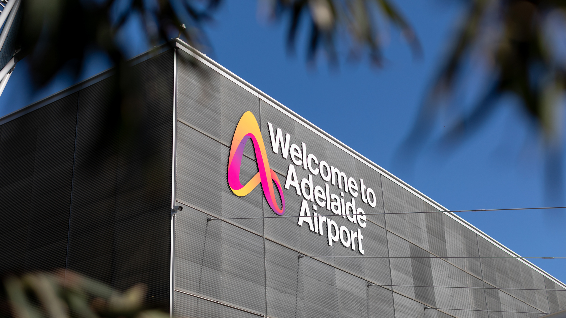
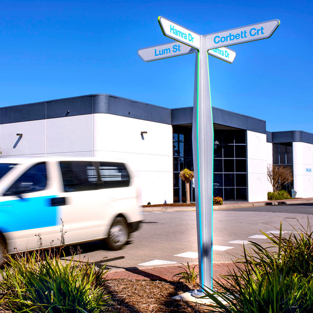
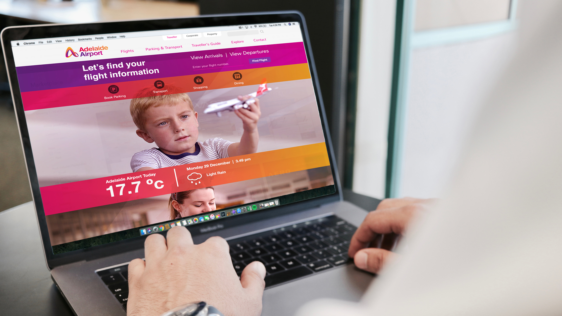
The chosen identity was a smooth, continuous line curving gracefully into an infinite loop to form an uppercase ‘A’ — an expression of the ease and seamlessness that is the hallmark of Adelaide Airport’s customer experience and the endless opportunities it affords. A key factor in the brand design was the decision to create two entities – a ‘Traveller’ brand identity and a ‘Corporate’ brand identity using contemporary colours to differentiate the two key elements of the airport’s business.
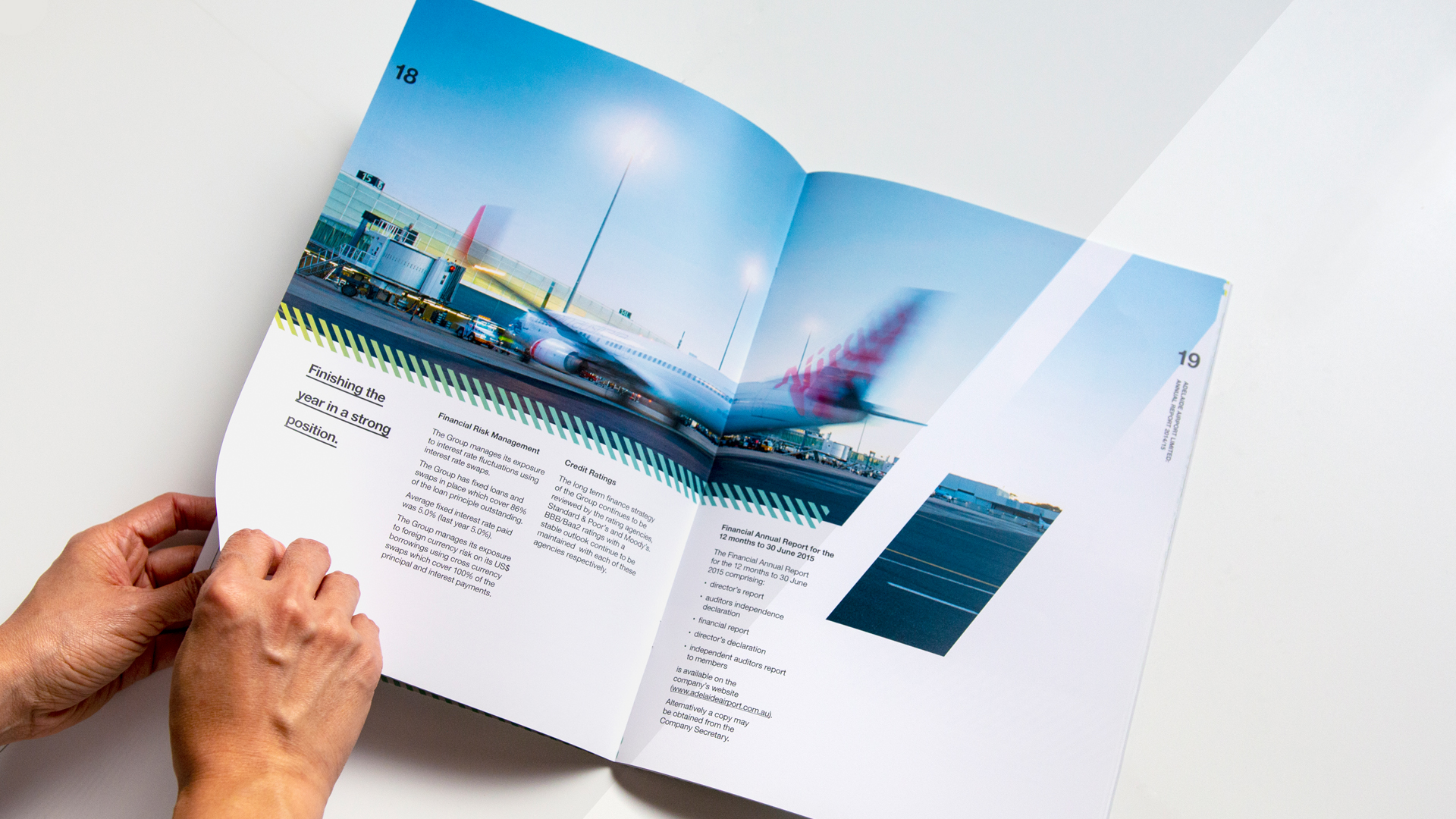
The corporate brand formed a key part of the Vision launch, which included AAL’s announcement that it would create an Airport Business District to attract industry clusters to the precinct. The “Traveller” brand identity was conceived to address passenger audiences in a warm and friendly manner. Hence the use of a bright and gradiented colour palette that could be used flexibly across all customer touchpoints.
The corporate brand formed a key part of the Vision launch, which included AAL’s announcement that it would create an Airport Business District to attract industry clusters to the precinct. The “Traveller” brand identity was conceived to address passenger audiences in a warm and friendly manner. Hence the use of a bright and gradiented colour palette that could be used flexibly across all customer touchpoints.