St Louis
A new look for one of South Australia’s most loved brands.
With a clear goal to consolidate their position as a premium purveyor of European desserts (not just ice cream), St Louis presented Nicknack with a massive challenge: to reinvent their visual identity in a manner that would still clearly identify the brand to key audiences.

The need for change. But what? How?
Having started off with great success 10 years ago, the St Louis brand was now finding itself in a bit of a marketing rut. Anecdotally, the brand seemed to have moved from being the place where all the “cool kids” hung out to being the place where parents and grandparents go for dessert. Nevertheless, business seemed to be doing just fine in terms of existing local franchises, as well as enquiries coming from the South Australian market as well as interstate. However, there was a concern that allowing the brand to stagnate would allow competitors to steal mindshare and marketshare. Something clearly needed to change with how the brand was marketed.

Brand Strategy & Positioning: Where does the brand sit in the competitive landscape?
With a clear understanding of who the competitors were, Nicknack walked the client through a competitive analysis from which it became clear that the St Louis brand was perceived more as the place for traditional desserts whereas competitors had successfully positioned themselves as contemporary and trendy gelato bars. St Louis also had a new gelato bar on the way. But how would this resonate with audiences who were used to seeing the brand in a traditional light?
Further analysis of the brand’s culture and story revealed a disconnect between values and visual expression. This prompted a repositioning strategy in which the brand pillars and brand visual codes were all revised to shift brand perceptions in the direction of a premium, European dessert experience.
Further analysis of the brand’s culture and story revealed a disconnect between values and visual expression. This prompted a repositioning strategy in which the brand pillars and brand visual codes were all revised to shift brand perceptions in the direction of a premium, European dessert experience.


Creative strategy: Developing a design direction that cuts through the clutter
Now that the strategic direction of the brand was clear, the task moved to design development. The objective was clear: shift customer perceptions so they would no longer see the brand as traditional and stale, but stylish and contemporary, in a way that signalled European class and sophistication.
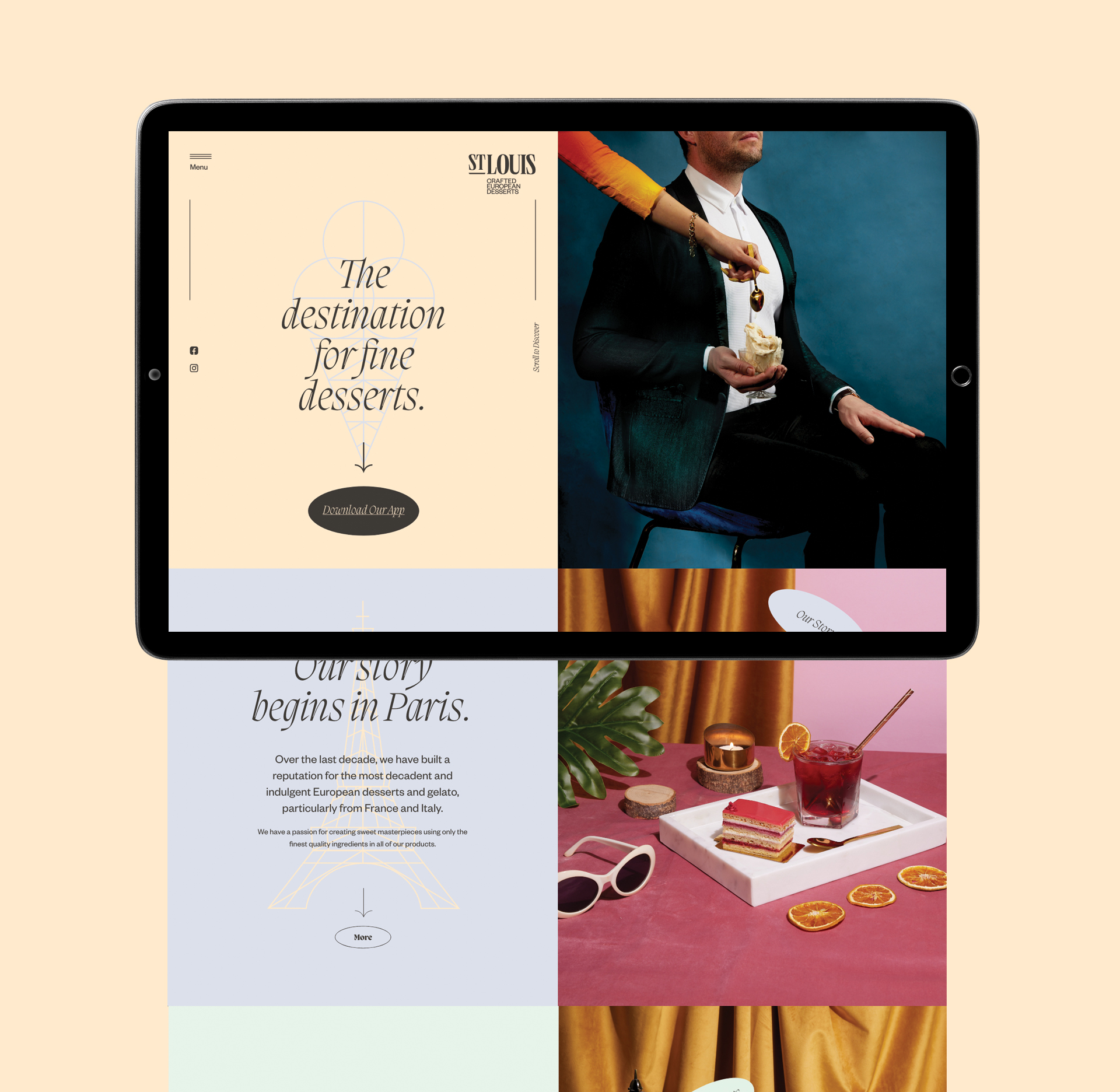
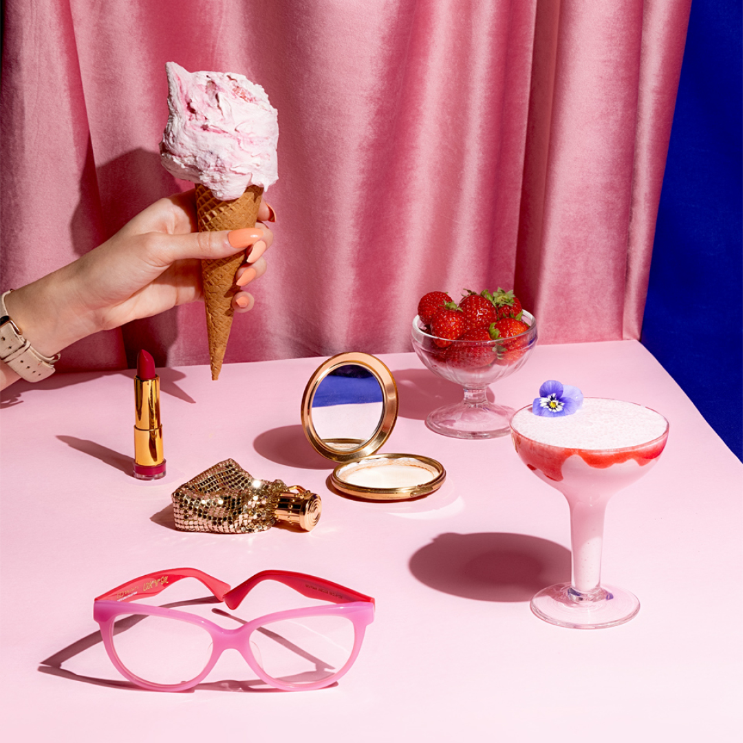
The client had a vision for a certain photography style that Nicknack brought to life with a range of highly styled artefacts placed along with various items on the menu.
This was complemented by a range of custom illustrations developed in a unique style that underscored the brand’s European heritage. These were used to bring new life to the packaging, menu and website.


Website design: Bringing the brand direction alive online
Having clear strategic intention, creative direction, and marketing assets, it was easy to develop an integrated solution for website design that aligned with the rest of the branding components.
Along with photography and illustration, typography was another key element that helped emphasise the contemporary nature of the brand.
A responsive website design was delivered, along with custom functionalities that allowed the client to update their locations as needed with a custom CMS, while also seeking out franchise opportunities. Staff could also apply for jobs and upload their CVs using the website.