Developing the identity.

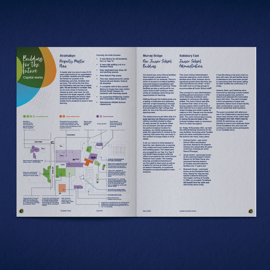
With “Community” being a key brand pillar, the intention of the publication was to engage parents, staff, students and old scholars with recent developments across the three school campuses. An identity was needed that would clearly communicate the newsletter name (Tyndalian Times) whilst staying within the brand guidelines. A clean and minimalist publication identity was developed that reflected the school’s Christian values in an understated manner.

Engaging photography style.

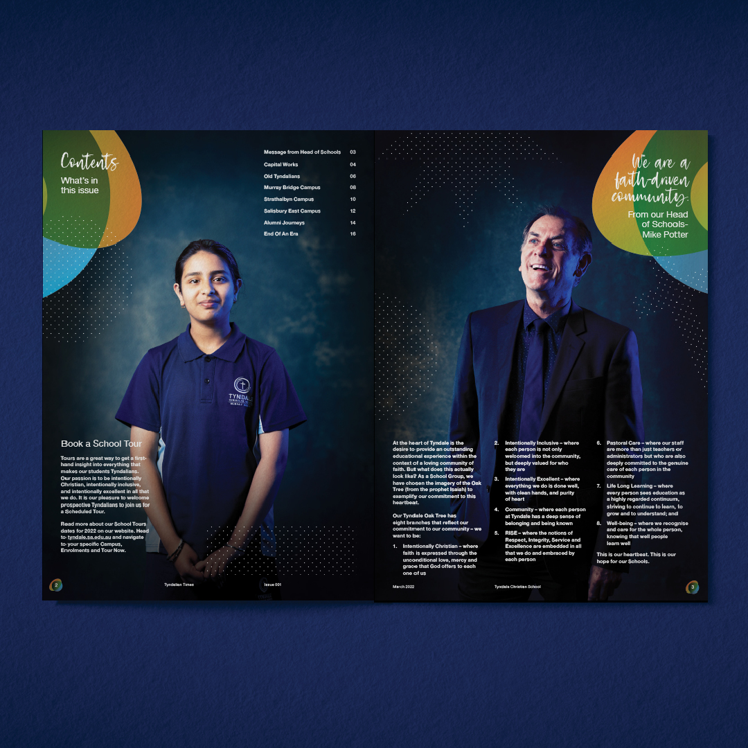
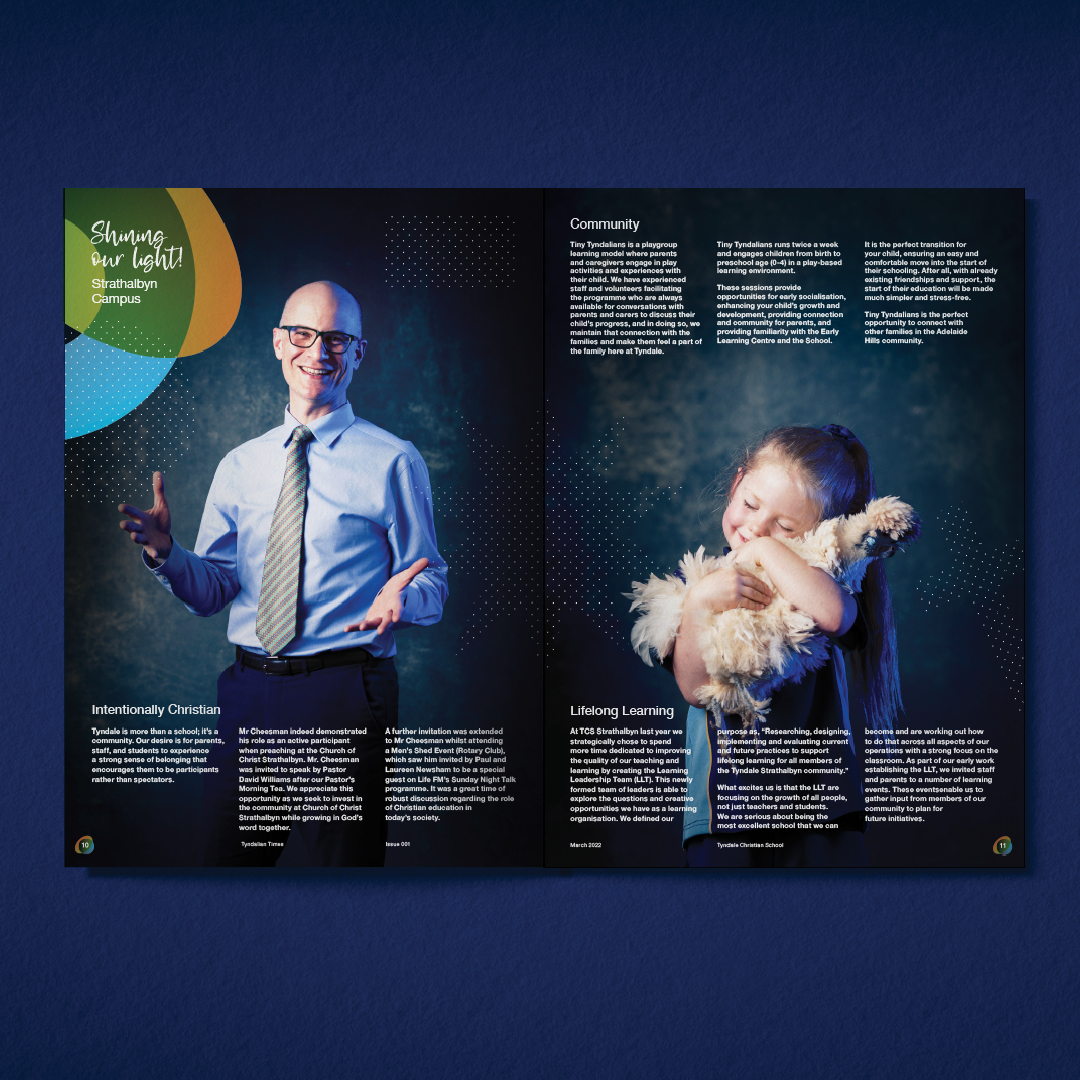
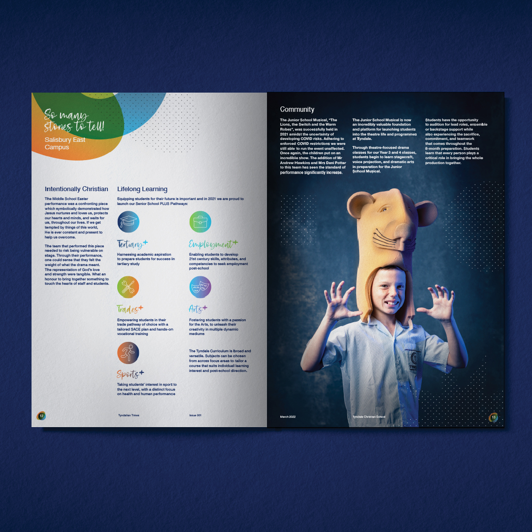
The new photography style used a technique that literally bathed the subjects in the brand colours whilst against a neutral backdrop. Whilst the subjects were chosen based on key stories in the newsletter, the result was images that really captured their unique personalities, bringing a sense of warmth to the imagery. Having the lighting and background set also meant that subjects across all three school campuses could be photographed in a consistent style whilst still allowing them to bring their own nature and character to the shot.

Bringing it all together.

The challenge for the publication design was to create something fresh whilst staying within the brand guidelines already set. This was achieved through the unique photography style which brought a completely new look to the brand communication. However, consistent use of the brand colour gradients and shapes helped introduce familiar brand identity elements in a subtle yet definitive manner.